

Mapa Sound is a NYC Audio Post Production Company
Building Mapa Sound’s website with the user in mind.
The company has recently undergone a redesign to simplify the user experience and make it more user-friendly and intuitive. This case study will examine the design changes made and evaluate their impact on the overall user experience.
The challenge
Before the redesign, Mapa’s website was cluttered and difficult to navigate. The information was presented in a way that was confusing and overwhelming to users. The menu was cluttered with multiple options and sub-options, making it difficult for users to find what they were looking for. Additionally, the site was slow to load, which was a major issue for users who were looking for quick access to information and services.
The solution
The solution came in the form of a redesign of the website focused on simplifying the user experience. The menu was streamlined to make it easier for users to find what they were looking for. The information was reorganized and presented in a clear and concise manner, making it easy for users to understand. The site was optimized for speed, ensuring that pages loaded quickly and efficiently.
The outcome
The simplified menu and clear presentation of information have all contributed to the success of the redesign. After testing rounds and iterations were done, testers gave positive feedback, indicating that potential clients of Mapa Sound would consider about hiring them after using the website.
Make it easy and fast to use for everyone, everywhere

Streamline the music discovery and audio services
Create an intuitive and visually appealing website

Key Objectives
We want to create an exciting experience to attract potential clients. Understand their needs and simplify the process. How do we do it?
The Process
Research was done to
-
Gain a better understanding of popular ways audio production companies present themselves online.
-
Understand how potential users (businesses and ad agencies) choose production companies to hire.
The research helped define
-
The proposed solution of a redesigned version of the Mapa Sound website.
-
How the redesigned website would be more faced towards clients, and how to organize information for the future state.
The Design phase
-
Developed responsive designs for the website's future state, highlighting Mapa’s audio production work more.
The solution to the problem was validated
-
Through user experience testing with potential clients to understand if this future state is effective at giving the user all the information they need to inform their decision.


Design


Validate


Research
Define


Researching audio production companies and their target audiences
Clarifying the Users and their Problem
To begin the process, I met with Bela, a producer and business manager at Mapa Sound and had a conversation pertaining to information about Mapa and its website. From there, several key points were identified to look out for during the design process.
-
Their target business goal is to increase the number of clients they work with.
-
Their target audience for their website is currently business owners and ad agencies that are looking to hire a production company for audio work.
Secondary Research
Initial research was done to understand the video industry as well as any major UX choices that need to be taken into account when building a site like this, such as common practices, working with video, etc.
-
According to NNG, research indicates that potential users of websites “resented video as the sole way to get a piece of information.”
-
Much of what users do in terms of video consumption when entering websites is based on preexisting habits of the user.
-
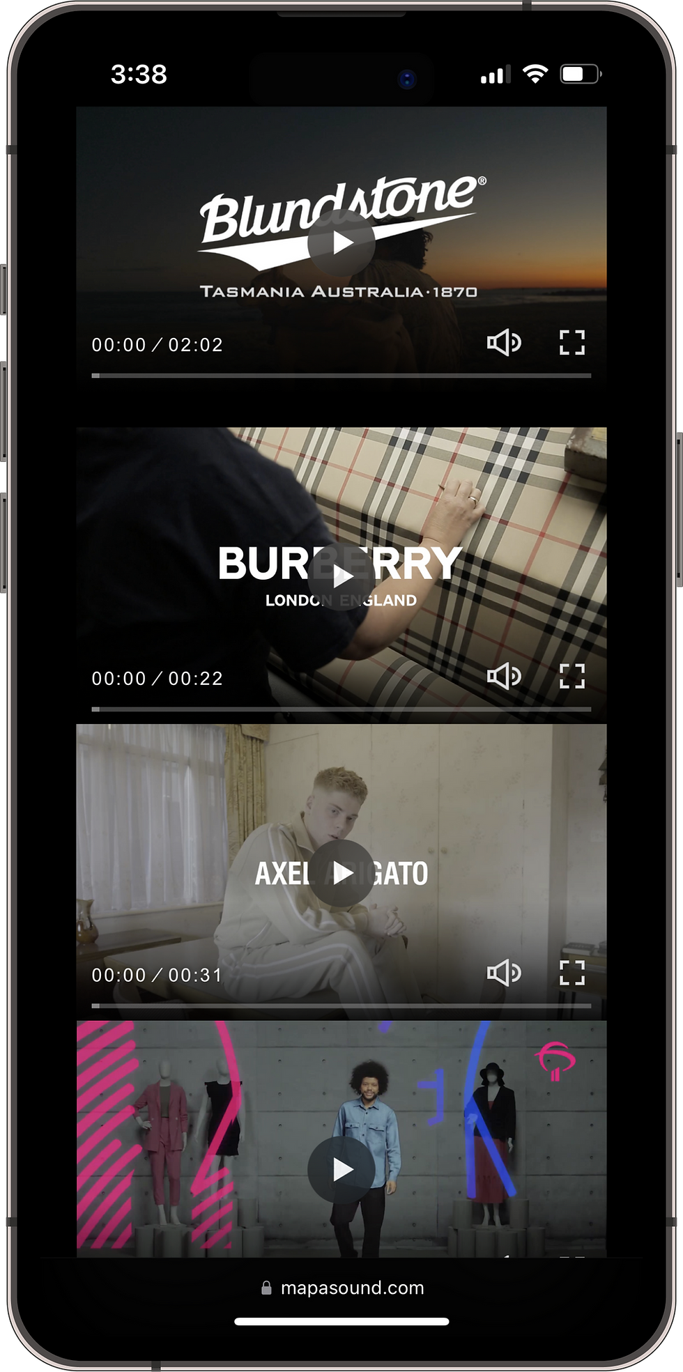
A staple of the average audiovisual production website is the showreel (A compilation of best video shots over a time period). And while these showreels can be effective at showing the pure quality that a production company can output with their work, over-reliance on the showreel as the main selling point seems like it could cause more harm than good according to research.
Interview Findings
Following my interviews with potential clients, it was apparent that the website lacked sufficient information and a visually appealing design. I conducted secondary research from the perspective of a business owner and advertising agency seeking to hire a production company. The insights gained shed light on the most crucial factors that these entities consider when selecting an audio company. Here are some key factors:
-
Trust that the company can deliver effective final products.
-
Analytics and impact from previous work, did they boost views? Engagement? Conversion?
Heuristic Analysis
While Mapa’s website has a strong color scheme and creative layout, once put under the microscope it was clear that their site had issues in areas of that need to be taken into account when building the future state. These were some of the heuristics that Mapa’s current state website failed to meet;
-
User Control and Freedom
-
Consistency and Standards Error Prevention
-
Aesthetic and Minimalist Design


Sitemap Creation
Creation of a sitemap was key to understanding how users would interact with these new features.
Once research was completed, the proposed solution was to create a redesigned version of the Mapa website with the goal of streamlining the user flow and attracting new clients. These major factors were considered when defining and designing the future state;
-
Simpler layout of information.
-
More focus on the audio work itself
-
More about the defined services and process for the user to learn about while considering their options.
-
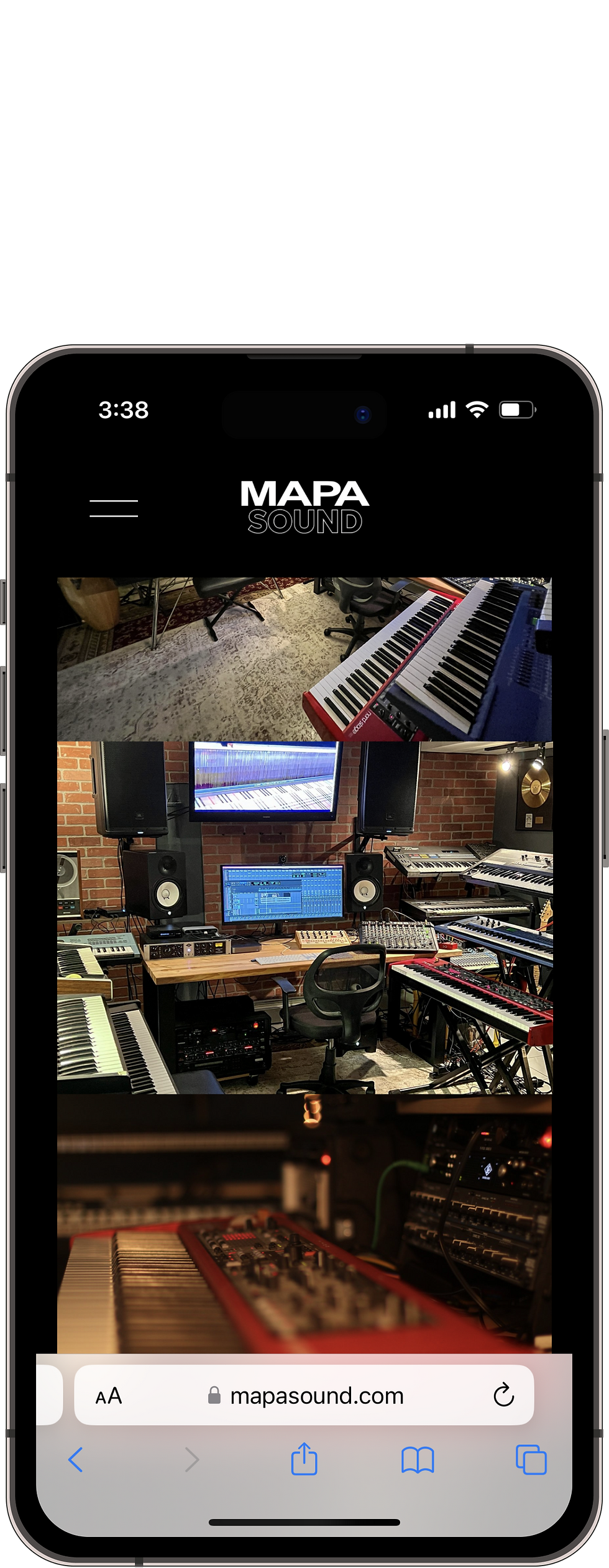
More high quality photos of the studio and equipment
-
Add photos and a small description of people working at/for Mapa


Redesigning with the
client in mind
Wireframes
Once a sitemap and user flow were created, a set of low-fi wireframes were created for both desktop and mobile versions of the website, given that Mapa’s current state is unresponsive, it was imperative that responsive design was taken into account for desktop and mobile versions.
High-Fidelity Wireframes
The low-fi wireframes were then transferred into a set of high-fidelity wireframes with implemented UI.


Usability Testing Experience
Multiple potential users, including a business owner and an advertising agency representative with experience hiring audio production companies, were recruited for user testing. Through a Zoom call, testers explored both the current website and a prototype of the future state. Testers were then asked questions about their experience with the redesigned version, and engaged in a conversation about key factors they look for when evaluating audio production company websites.
Key Findings
-
Intuitive Navigation: The new website features an intuitive navigation structure, making it easy for users to find what they're looking for.
-
Clear and Concise Information: The information on the site is presented in a clear and concise manner, ensuring that users understand the services offered by Mapa Sound.
-
Improved Aesthetic: The new design of the website is visually appealing, creating a professional image for Mapa Sound.
-
Fast Loading Speed: The site has been optimized for speed, ensuring that pages load quickly and efficiently, improving the overall user experience.
-
Enhanced User Experience: The new website has been designed with the user experience in mind, making it easier for users to access the information they need and interact with the site.
Defining the Solution
The Outcome
After getting positive feedback from user tests and with the design direction, I spent some time working on polishing the visual design. The company's quality and skills are successfully displayed on the new website, which has boosted Mapa Sound popularity in the provision of music composition and audio post-production services.
Click here to view the prototype.
_edited.jpg)

My role:
UX Researcher, UX Designer, UI Designer
Client:
Mapa Sound
Research goals
-
Examination of existing pages within Mapa’s website to identify any potential pain points to the user’s experience.
-
Determine how other production companies of varying sizes handle their online web presence to identify weaknesses and strengths to apply that analysis to Mapa’s website.

Competitive Analysis
Analysis of other production companies within the local area was done to find common ground between them in terms of presentation, content, and presence.
-
Like Radish, all companies examined had a website that was focused towards selling themselves to their users (potential clients).
-
The “Showreel” was heavily favored as the main way to draw in potential clients, however websites that relied heavily on just the showreel often felt less effective compared to websites that used text, graphics, and analytics.
Building the Journey
Then a Customer Journey Map was then crafted with identified phases of a users journey with the current state of Mapa’s website to better understand how the future state could improve upon the current state.

User Task Flow
A user flow was also created to understand the decision-making would be going through the user when using this website. This was a key document to understand exactly how a potential user would interact with the future state.
Validating the solution
with real users
The future state's desktop and mobile versions are both quite straightforward from a usability perspective, consequently testing shifted its focus to evaluating the overall user experience when using the future state.

Branding with
The Oscilloscope
So, I did some research and found out that most audio companies are all about the neon signs and flashy logos. But, did you know that the oscilloscope was the pioneer of turning sound waves into eye-popping images? I was so intrigued that I managed to get myself one of these old machines and even learned how to code it to create some interesting visuals and to manipulate the XY axis to be able to write the company's name in it.
After playing around with this machine, I got the idea of making a video where scientists were doing some funky experiments through the oscilloscope. It was so much fun, and you can watch the final masterpiece below!
